BACKGROUND & BRIEF
ReturnOnTalent is a HR SaaS software solution which facilitates internal hiring to alleviate the hiring costs and constraints associated with external hiring and high turnover rates. It is a SaaS (Software as a Service) product, meaning that customers subscribe to a plan to use it, via the Internet.
Our focus was to understand software solution purchasing behaviours by key decision-makers, in order to design a key benefits webpage that better communicates ReturnOnTalent's Unique Selling Propositions (USPs).
Our Project Objectives:
-
Distinctly differentiate ReturnOnTalent from their competitors.
-
Communicate Key Benefits/USP in a better way to Key Decision-Makers
-
Good understanding of Product-Market-Fit which is clear and structured.
-
Improve clickthrough rate, (i.e. Key Decision-Makers booking a demo, as ReturnOnTalent had no real clients at the point of engaging our team)
HIGH LEVEL TIMELINE
Total - 1 month:
-
2 weeks research work
-
2 weeks design of prototype & testing
TOPICS COVERED
PROJECT SCENARIO
A team of 4 UX/UI designers working under CuriousCore
How Might We help key decision-makers who make the primary purchasing decisions in their company, understand the USPs of ReturnonTalent SaaS software,
So That they will contact ReturnonTalent for a demo and buy ReturnonTalent as a solution for their company.
OUR DESIGN PROCESS


DISCOVERY STAGE
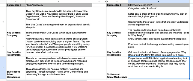
Competitive Analysis & Stakeholder Interviews
We held Stakeholder Interview consultations with ReturnOnTalent's Founder & Product Lead to understand the SaaS platform better and the challenges faced when pitching to prospects.
In the meantime, we also conducted Competitive Analysis on competing HR platforms, Gloat & Reejig, paying attention to how they craft and present their key benefits' message.
Research Objectives
-
Discover and understand what benefits interest Key Decision-Makers to book a demo.
-
Evaluate how the Key Decision-Makers perceive ReturnOnTalent
User Interviews & Usability Testing of ROT's Landing Page
Interviewed 5 Key Decision-Makers from HR Business Partners to Finance Directors, who purchased a SaaS solution, about their past experiences making a purchase decision.
Also instructed these Key Decision-Makers to interact with the current landing page site while observing their reactions
Example Questions Asked During Interviews
"Recall back to the last time you made a purchase decision of a software solution. Walk me through the steps you took when making that decision?
-
What are your considerations when you are trying to purchase a SaaS software solution?"
"Can you tell me about a time when purchasing a software solution was frustrating or didn’t work out for you?"
"What are the biggest pain points you experience in terms of browsing through ReturnOnTalent’s website?"
RESEARCH SYNTHESIS: INSIGHTS & DELIVERABLES
Affinity Mapping
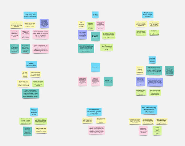
We wrote down all notable quotes and observations and grouped them into similar, common, identifiable themes.
The purpose of affinity diagramming was to derive key insights which will inform our understanding of who are our users, what their journey is like, and what content is important to them.
Top 3 Key Insights & Recommendations
1 ) Integration with Existing Software
4/5 key decision-makers indicate that the software's ability to Integrate with their company's existing software and tools is an important consideration on whether they would purchase the SaaS.
Therefore, we should feature ReturnOnTalent's ability to integrate and be compatible with multiple HR software and tools as a key benefit.
2 ) Ease of Navigation & Use
Users expressed frustration with complicated user flows and navigation of the systems, so ReturnOnTalent can present a more simplified form of navigation for their SaaS solution to convey ease of use of the platform.
3 ) Mobility and Retention of Talent
Mobility and Retention of talent is one of the main issues in organisations, so ReturnOnTalent can capitalise on this pain point to address the lack of internal opportunities.
USER PERSONA
WHAT IS OUR PERSONA'S JOURNEY LIKE?
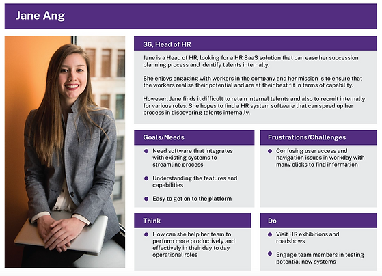
We drew out the journey map of our Persona (Jane Ang) who is an archetype of the people we interviewed, to highlight key points where they interact with ReturnOnTalent and then note down their Needs & Pain Points as well as Feelings.
This aided us in knowing where inefficiencies occur and what possible USPs we could highlight to turn those Pain Points into Opportunities to delight.

IDEATION STAGE

Low Fidelity Wireframing
Base on the Competitive Analysis and our User Research insights that we did earlier, we lay out the basic wireframe structure of Our Key Benefits webpage in Figma.
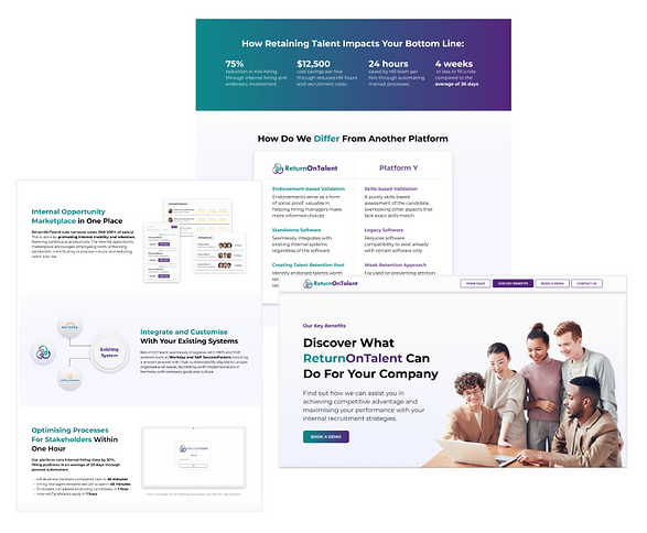
The Bottomline Impact section was created because Key Decision-Makers wanted to know how internal recruitment affected their balance sheets. While the Competitor's Comparison table was derived due to Users stating they want to know how ReturnOnTalent stacks up against their competitors.
DESIGN & TESTING : ITERATIVE IMPROVEMENTS
WE KEPT REFINING AND TESTING THE HIGH FIDELITY PROTOTYPE A FEW MORE TIMES WITH 5 TESTERS, CHURNING OUT ITERATIONS 2.0 AND 3.0...

Most testers said the images for "Easy Usage and Navigation" and "Mobility and Retention" didn't exemplify the points they were making.
Many of the testers mentioned that the main 3 Key Benefits' (USPs) flow was weird and not in order of importance
They proposed that the "Mobility and Retention" Key Benefit should be placed first as its the main crux/feature of ReturnOnTalent.
In addition, many of the testers also commented that the images don't support and showcase what the copy is trying to sell. So we made changes to the images and copy text as well.
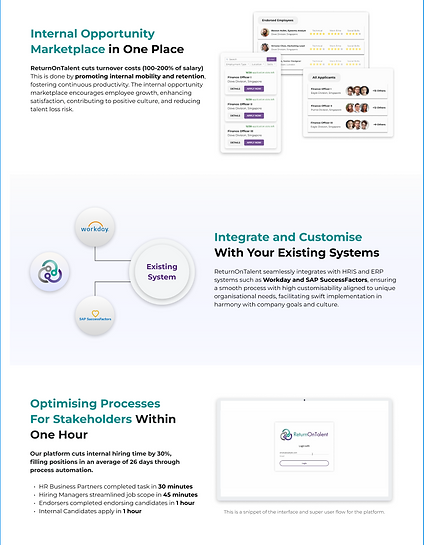
All Testers feedback that the images/animation for all 3 USPs exemplified the points well

We thought a pragmatic presentation of the facts and figures would appeal to Key Decision-Makers.
The Impact Bottom Line section and Comparison Table were well received by testers who found the data useful, but there were across the board unanimous disdain for the aesthetics that they were presented in.
So we re-designed the presentation of the Impact Bottom Line section and Comparison Table to list the facts out in a bigger and more clean way.
Heeding our testers' want for more testimonials, for our Testimonial section we added 3 testimonials that can be interactively changed by clicking on the arrow buttons.

We reimagined the presentation of the fact and figures with a more clean, strealined and impactful visual design.
Our major finding was that testers read by skimming through content.
Impact
Through the 2 rounds of usability testing, 5 Key Decision-Makers validated our design interventions in addressing the problems identified.
All the Key Decision-Makers from both rounds were able to identify and articulate the key benefits, which were: Mobility & Retention of Talent, Integration with Existing Software and Ease of Navigation & Use.
After the design of the Key Benefits Page, 4/5 of the Key-Decision Makers mentioned that they are prompted to book a demo.


FINAL DESIGN
LESSONS LEARNED
Getting busy top executives, especially the Key Decision-Makers of a company to notice and care about a products' benefits (USPs) is a challenge.
-
As our target users were a particularly niche group with busy schedules and do not hang out in survey groups on Telegram, it was difficult to reach out to them and get them to talk. Fortunately, our UX Manager Daylon, was able to connect us with some users, but it still took up more time than expected.
-
I was pretty anxious and panicked when we didn't have any users lined up to talk to, but gradually help did come along the way, and we had an excellent team leader who handled the liaising and organisational details of the user interviews. I learnt from this episode to trust the process and to have a wide networking circle which could come in handy one day.

