THE CHALLENGE
"How Might We design a MVP prototype to alleviate the daily hassle of finding food for a Singaporean worker bee?"
This project started as a design prompt where I was tasked to identify and solve a key problem my friend had in his daily life. Daniel confided that he had problems locating tasty and inexpensive food near his workplace in the Central Business District (CBD) area.
While Singapore’s CBD area is not short of excellent cuisine, for palatable hawker fare, it is usually a good 15-minute walk to major food centres, depending on one’s office location.
HIGH LEVEL TIMELINE
Total - 3 weeks:
-
4 days rapid prototyping
-
2 weeks iterative testing & high fidelity prototype
TOPICS COVERED
PROJECT SCENARIO
Individual project as part of General Assembly's UX Immersive bootcamp
LEAN UX DESIGN THINKING PROCESS


RESEARCH & INTERVIEWS
I compiled a research plan which informed the crafting of my interview questions that I posed to 5 interviewees. The plan helped define the research goals and clarify my initial hypotheses on workers’ food-related attitudes and behaviours. This makes me aware of my existing biases, and how it will impact my research.
My research goals were to discover, learn and understand:
-
Behaviour Patterns, Current Popular Solutions & Un-addressed Pain Points indicate what's intuitive to workers, and subsequently helps to inform and refine the app's execution.
-
Probing Underlying Drivers & Emotions, on the other hand, allows me to tap into hidden motivations and feelings to elevate the user experience from good to great, when I re-create the same meal conditions valued by office workers.
KEY INSIGHTS FROM AFFINITY MAPPING & MARKET RESEARCH:
Underserved Market with Limited Options
Most hawkers in CBD vicinity close after 3 pm.
Food options available after lunch cater primarily to up-market tastes where meals cost on average, SGD12 per meal per person.
Habits Vary, Considerations Same
When, Where & How people decide to eat differs greatly but food must be tasty, affordable & authentic.
Dining environment should be conveniently nearby and should not be over-crowded.
Office Workers are Time Sensitive
Most workers can only step away for 1 hour lunch-breaks.
The majority work overtime on a frequent basis, and order delivery to eat at their desk when on a tight deadline.
Prefer Eating Out with Colleagues
If workers can choose, they generally prefer getting away from the office environment to take a breather from work as opposed to eating in.
Having company to eat with, is also more enjoyable.
Dining Out is a Multi-faceted Experience
Every factor listed above are all equally important. However, soaking in the chef's backstory and cooking process is an added bonus that helps make the entire experience unique and novel.


"MEALS DURING THE WORKDAY ARE NOT ENJOYABLE, ESPECIALLY WHEN I HAVE TO RUSH FOR A DEADLINE."
THAT AHA! MOMENT
A constant theme emerged: Past 3 pm, office workers had limited food options around their office area when it comes to affordable hawker food.
UNDERSTANDING THE USER & PROBLEM
“As a hungry CBD office worker working overtime on a tight deadline, I want to eat tasty and affordable authentic meals easily, because I have limited time and budget to dine out for a good meal experience”
Locating and narrowing down food options is just half the battle won when it comes to a satisfying meal. Instead of creating yet another food location app, bringing food and happiness to office workers is more valuable.
Hence, I re-aligned my focus from simply finding food nearby, to getting a good meal.

The Persona: Meet Daniel
Creating a Persona to represent users, made me empathise with them - getting clear on their Demographics, Eating Habits, Considerations, Delights & Pain Points.
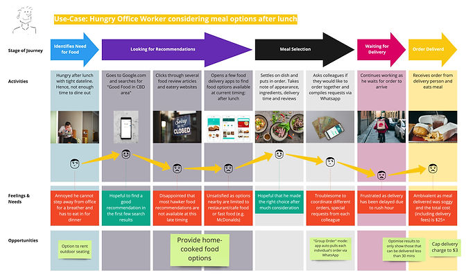
I also mapped out the persona's User Journey (below) through the use-case of an office worker ordering a meal when he has to overtime.
This made his pain points at each step of the journey clear, so I know what are the moments of opportunity where I can introduce features to resolve those pain points.

THE SOLUTION?
I visualised a mobile application concept that connects office workers in Singapore's CBD with home cooks located in the heartland (suburban) areas, called HeartH.
Users can place orders for home-cooked meals and have them delivered to their office at any time of day. Home cooks can start a side-hustle as a "hawker" from the comfort of their homes without paying exorbitant stall rents.
I drew out the following storyboard to illustrate a likely scenario of how our persona Daniel will use the app:

SKETCHING & USABILITY TESTING
After sketching the wireframes, I created a clickable low fidelity prototype in InvisionApp which I tested with one user. I observed her to be confused at various points of the ordering task, as conventional elements and interactions expected of a food delivery app were not present.
She provided invaluable feedback by suggesting I feature the home cooks’ specialities and skills more prominently to give users confidence in the amateur cooks' abilities.
Failure of V.1
As I didn’t have a visual design background, I consulted the design of several apps I enjoyed interacting with (e.g. Etsy), hoping to capture the same delight.
This proved disastrous, as I copied UI patterns and flows without understanding the context. When delivering home-cooked food from distributed vendors, allowing users to purchase from different home cooks within the same order meant operational difficulties in quality control.
Hence, showing cards by individual meals doesn't make sense.

TITLE OF THE CALLOUT BLOCK
THE SECOND TRY (V.2)
I illustrated a new User Flow Map to outline how Daniel will complete his task of ordering a meal. Then, working in incremental fidelity, I re-sketched the wireframes, layout in Invision Studio and constructed the Design System.
This time, I planned for alternative routes based on different scenarios like when ordering for an individual vs a group; or if the user prefers to find food using browse vs keyword search.
Previously, I either didn’t account for these routes or deviated too much from the main task to explore irrelevant tasks such as favouriting meals or messaging the home cook. These mini-tasks covered all bases, but including them would add to scope-creep and they were not essential at this phase of the project.
I chose the Invision Studio platform for seamless animation of micro-interactions and transitions for that extra user delight. To evoke the passion and authenticity of the home cooks, a colour palette revolving around orange and red was chosen. My font choice was to pair Ubuntu Light with Nunito — the rounded edges make for a relaxed and modern sensibility while retaining legibility.

PRESENTING.. HEARTH!


Authentic Meals with Backstory
-
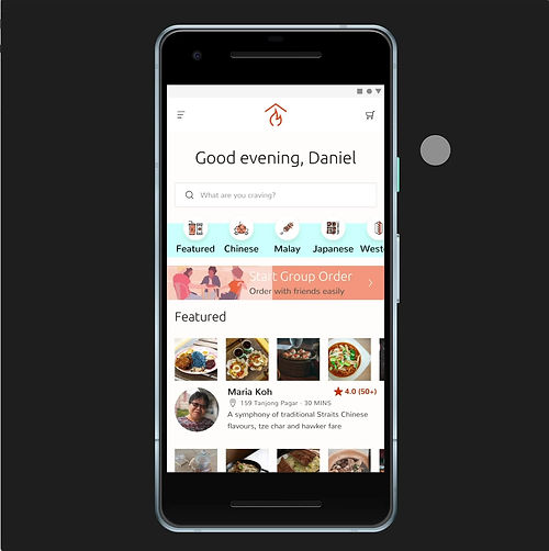
Homepage - Preview the home cook’s menu by side-scrolling dish photos, without having to navigate back-and-forth between pages.
-
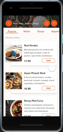
Home Cook Profile - Browse menu by categories. To picture the food, look at photos and read the ingredients displayed on the meal cards.
-
Read Reviews - Past customers’ reviews allow users to ascertain food quality and service standards before patronising.
Affordable, Tasty Food within Limited Budget & Time
The biggest pain point users had was having sub-optimal dining experiences. I designed a Filter page for them to explore home cooks using:
-
Sort
-
Price
-
Category


Estimated Time of Arrival
The ETA is repeatedly shown at various stages of the flow as a constant reminder and to inform users’ purchase decisions:
-
Before Checkout
-
Order Complete
-
Order Status
Better 'Add-to-Cart' Flow
I address the tester’s confusion and frustration by creating separate flows for meals with different requirements:
-
Add Animation - Clicking ‘Add’ button immediately adds non-customisable dishes to Cart.
-
Customise Meal - Clicking ‘Add’ button leads to a pop-up screen for users to customise meals that have different options to select from.


Novel & Social Dining Experience
New features to help coordinate group orders and eat out as a group:
-
Group Orders - Share WhatsApp link for invited members to put in their orders directly. Orders by individual members will be reflected in the Cart Summary before checkout.
-
Rent Outdoor Seating - Add on disposable cutlery and rent either a picnic mat or foldable tables and chairs for easy outdoor dining.
LESSONS LEARNED
From my experiments and failures, I learnt there was no traditional “right” or “wrong” design decision, what matters is if it was appropriate for the project’s context and constraints.
While I was a natural with discovery research and analysis tasks, I found implementing those research insights I found earlier into features and UI patterns, the most challenging.
-
Next time, I will research competitors within the same domain to reference their UI before I start designing.
-
Had I gotten my wireframes in the hands of people faster, I could have done usability testing of the high fidelity prototype to get more concrete results on its usability and make further improvements.
-
If I were to turn HeartH into a real startup, for the second phase, I would focus on interviewing home cooks to see if their pain points are feasible to address and if they would take to the idea. For instance, will amateur cooks be able to cook on-demand, or do orders have to be placed in advance for them to prepare?


